Kinetic: let the product carry the energy
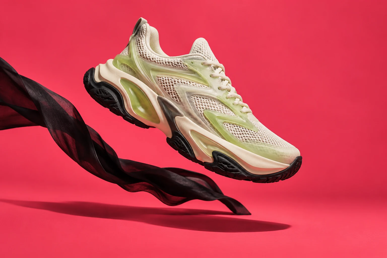
Kinetic is a performance-footwear campaign concept. A sculptural cream-and-lime shoe sits against coral, with a black ribbon giving the composition a directional line. The headline, “Move your own way,” supports the product’s expressive form without adding another competing story.
The design uses a strong contrast between the shoe, background and typography. The aim is a clear campaign hierarchy: notice the product, read the invitation, then discover the details. The movement is suggested by the composition itself, so the still image can hold attention without needing a screen animation.
Ripe: build a world around one clear idea
Ripe takes a brighter route. Citrus, hard sunlight and a yellow field support “Squeeze the day.” The image and headline speak about the same feeling, giving the drinks concept a straightforward visual hook. Product direction, colour and campaign copy work as one composition.
The image lab also places a daylight treatment beside an after-dark variation. The product remains the centre of the frame while the surrounding atmosphere changes to deeper green shadows and warmer edges. The draggable comparison lets visitors inspect the difference directly. These are AI-assisted image-direction studies, not documentary product photography.
Still: make room for material and texture
The Still ceramics editorial uses warm paper, chalk, clay and cobalt. Its quieter typography and generous space let the objects’ forms lead. A ceramics story asks for a different pace from a footwear campaign, so its layout leaves more room around each element.
The accompanying twenty-second film follows six distinct workshop shots. Longer holds create a progression through material, shaping, detail, firing, glazing and finished objects. The footage is licensed and credited in the project assets. The film presents an editing study; it does not claim that TurnOn Media filmed the workshop.
Noon: use architecture to organise the page
Noon is an architectural magazine-cover concept. The image gives the composition a sense of structure, while the type introduces an editorial voice. The cover’s subject and its arrangement of space do much of the work that louder colours perform in Kinetic or Ripe.
This difference is deliberate. A portfolio can show a consistent standard of care without making every subject use the same visual treatment. Repetition can help a brand system; across unrelated concept brands, too much repetition can hide the range of the work.
Show the finished design and the decisions
The Studio pairs the campaign gallery with a sketch-to-artboard view, image comparisons and the screening room. Finished work comes first, then the reader can inspect how layout, lighting and editing alter the feeling. A process view earns its place when it reveals a choice.
All four brands are fictional, self-initiated studies. There are no claimed sales results or client endorsements. The practical takeaway is to begin with the subject and its intended feeling, then choose the visual tools that make that feeling clear. A shoe, a citrus drink, a ceramic object and a building do not need the same voice.
This article discusses fictional portfolio concepts. Project images include AI-assisted visual-direction studies; the Studio film uses licensed footage. Read the media credits.